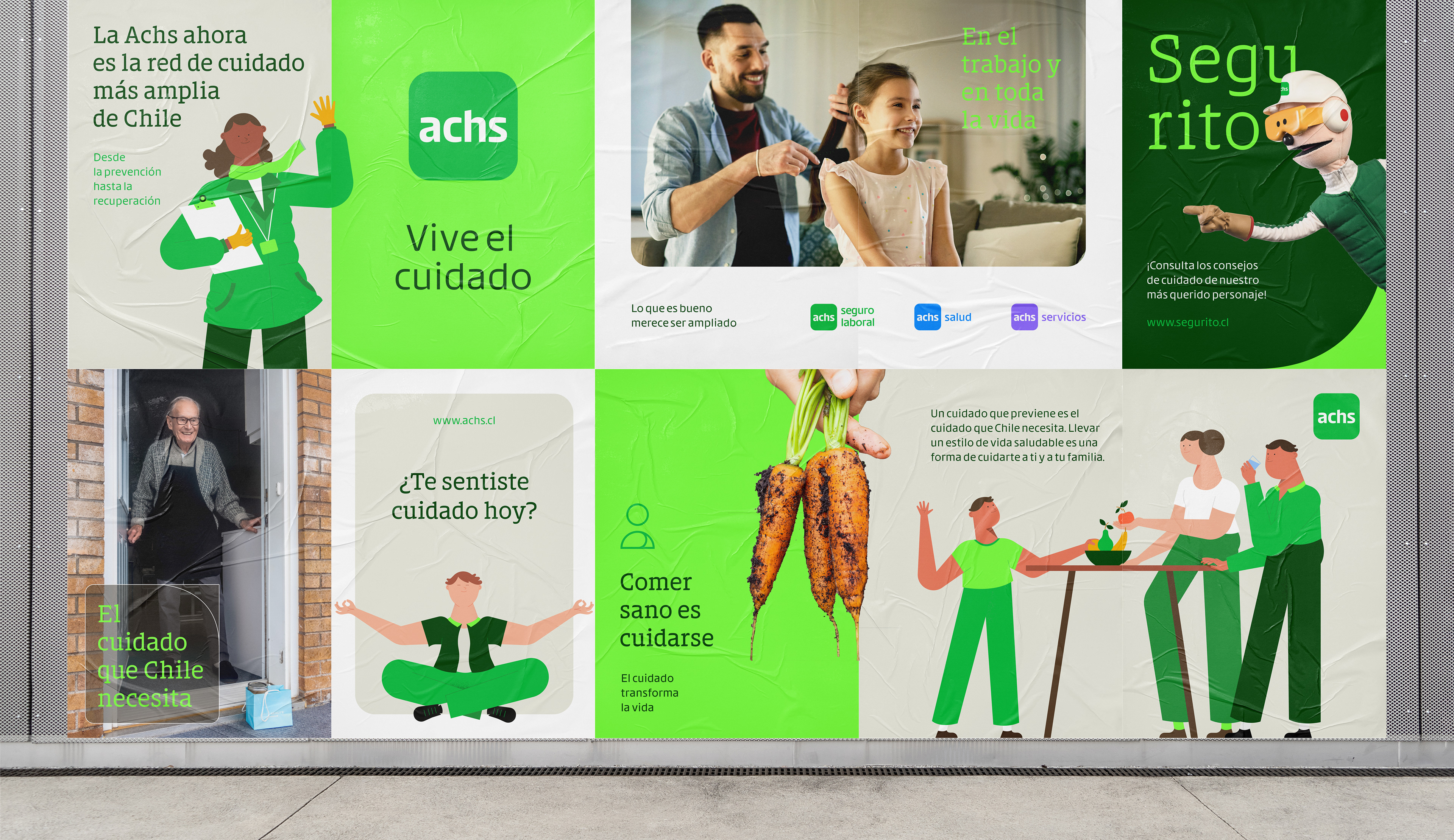
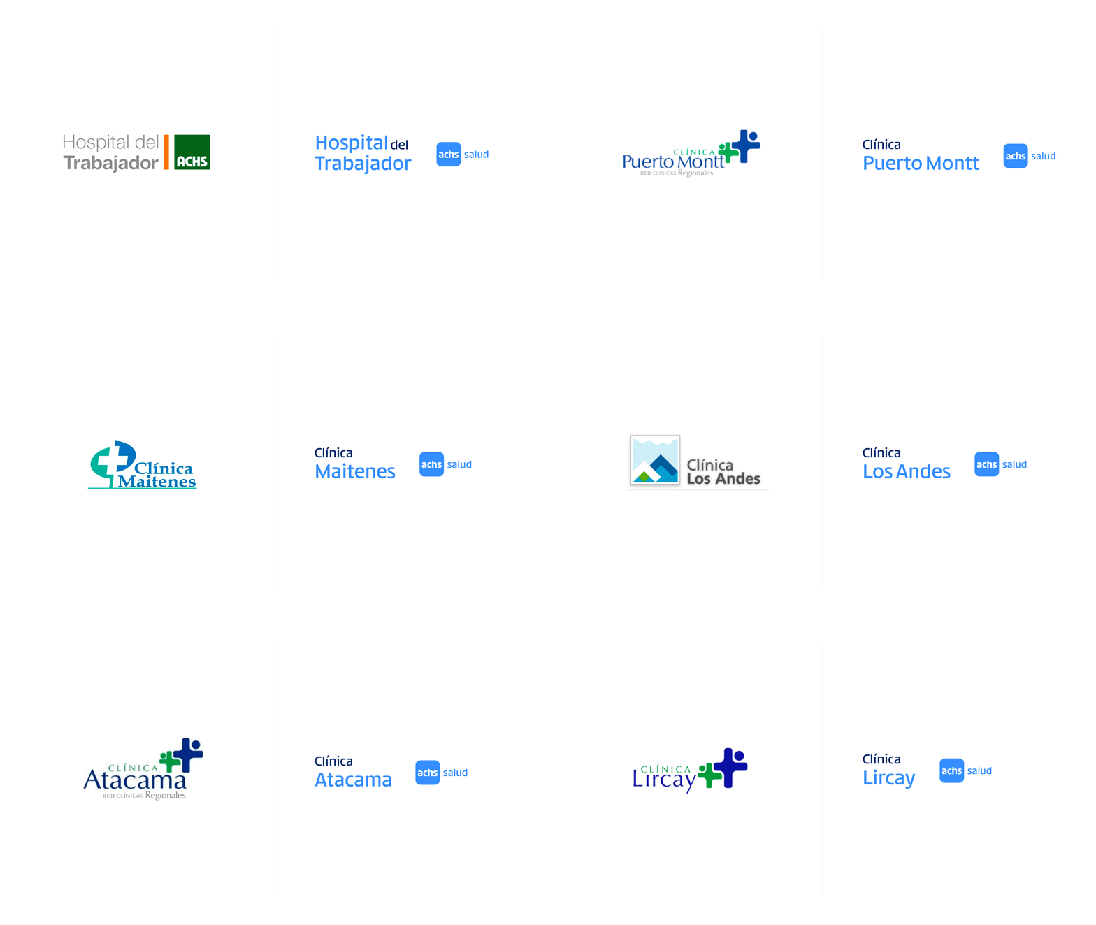
For 65 years Achs was Chile's workers' insurance brand. Then it decided to open its health network — 80 centres, a reference hospital and 7 clinics — to the entire country, not only affiliated workers. The challenge was to signal a shift of that size without losing what six decades had built.
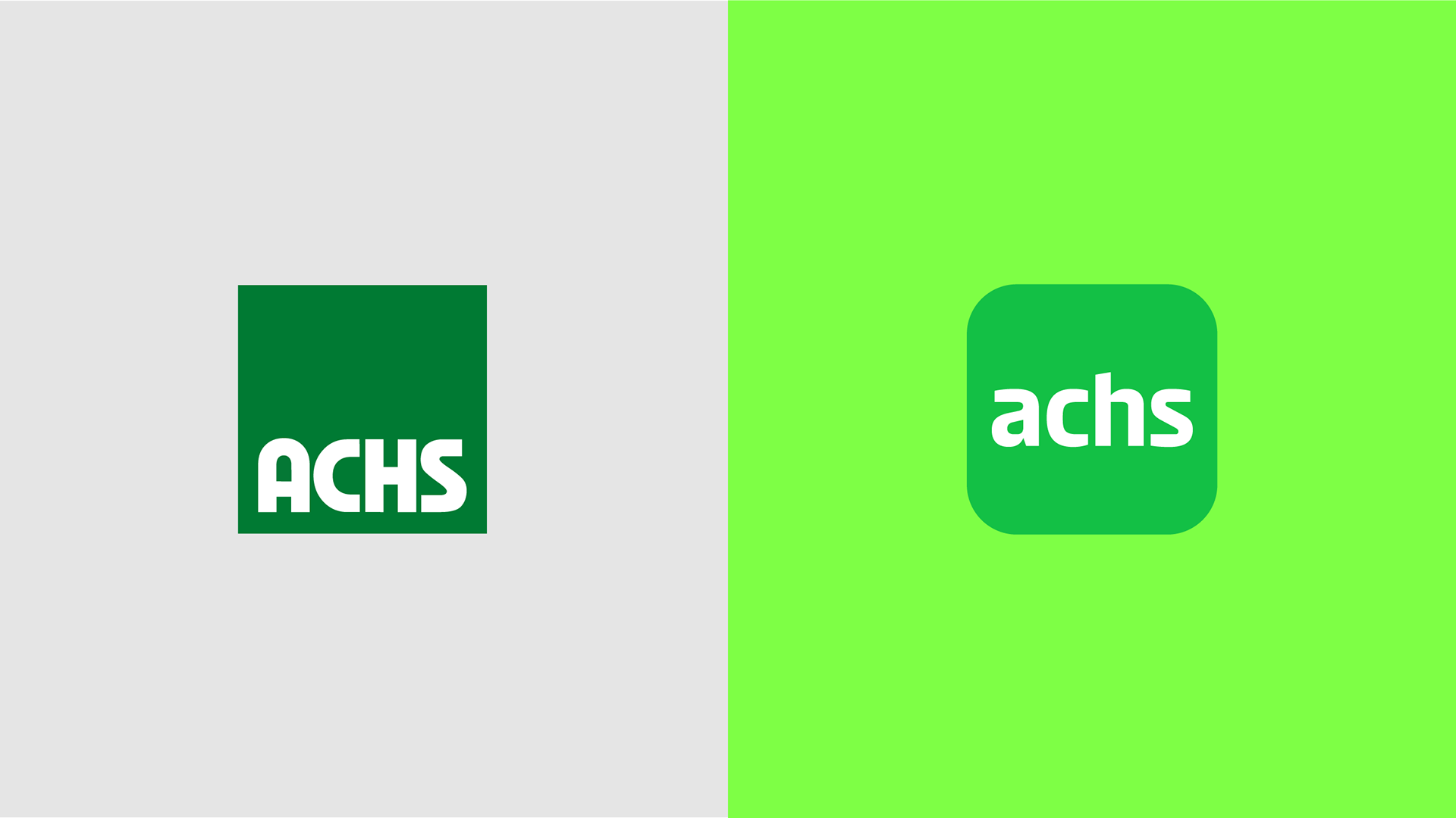
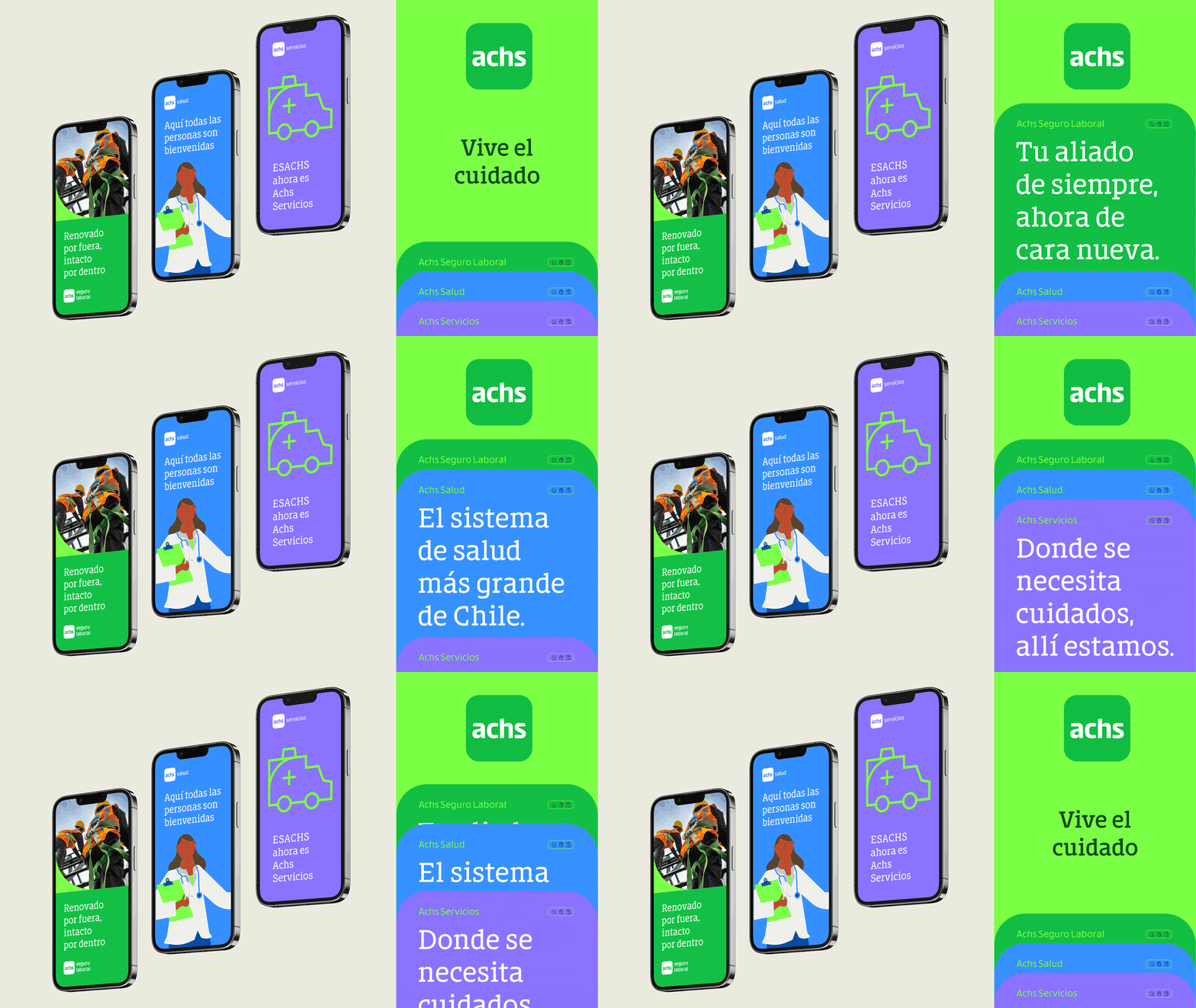
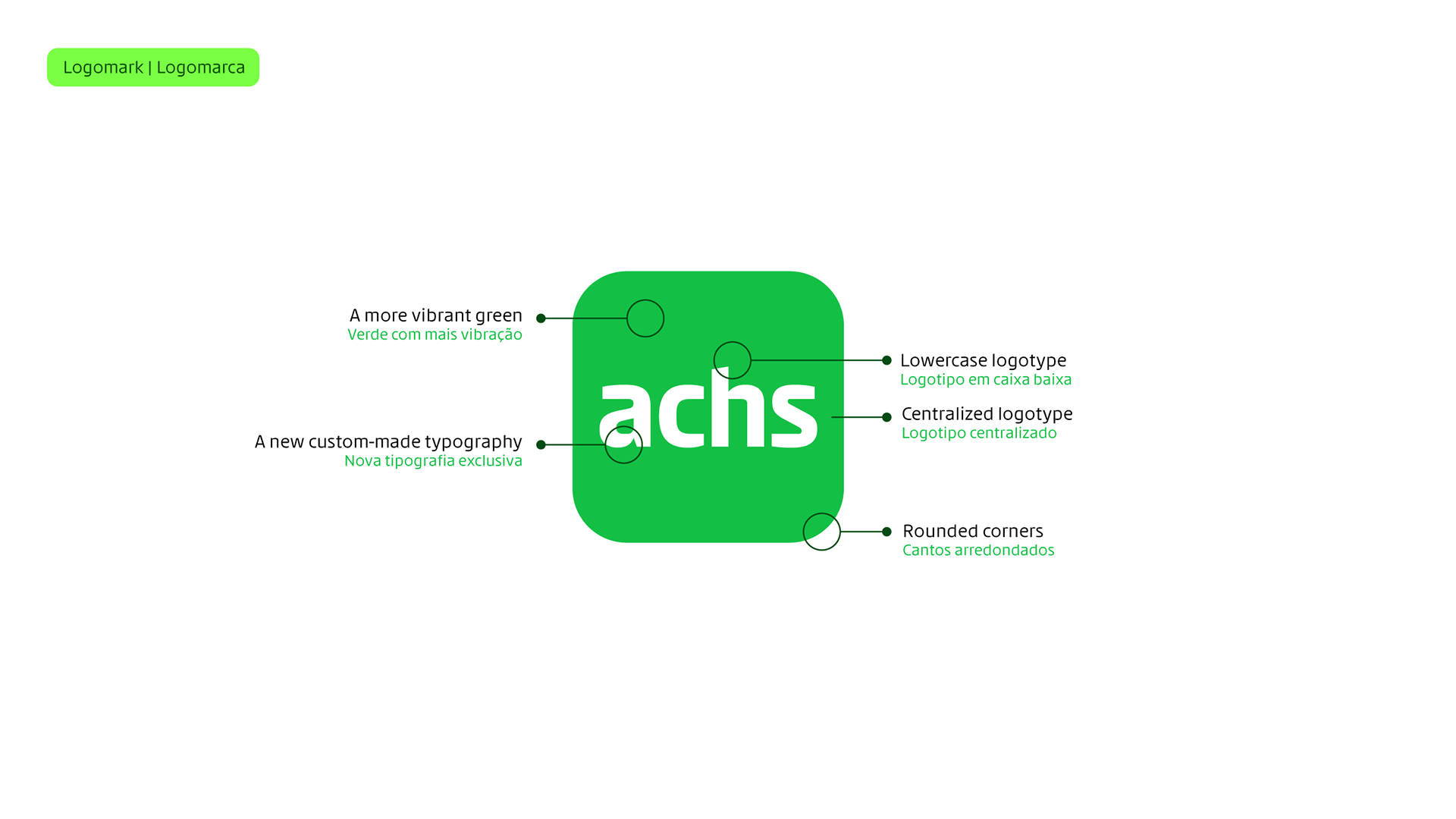
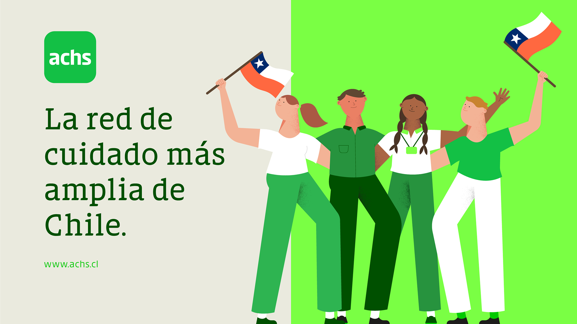
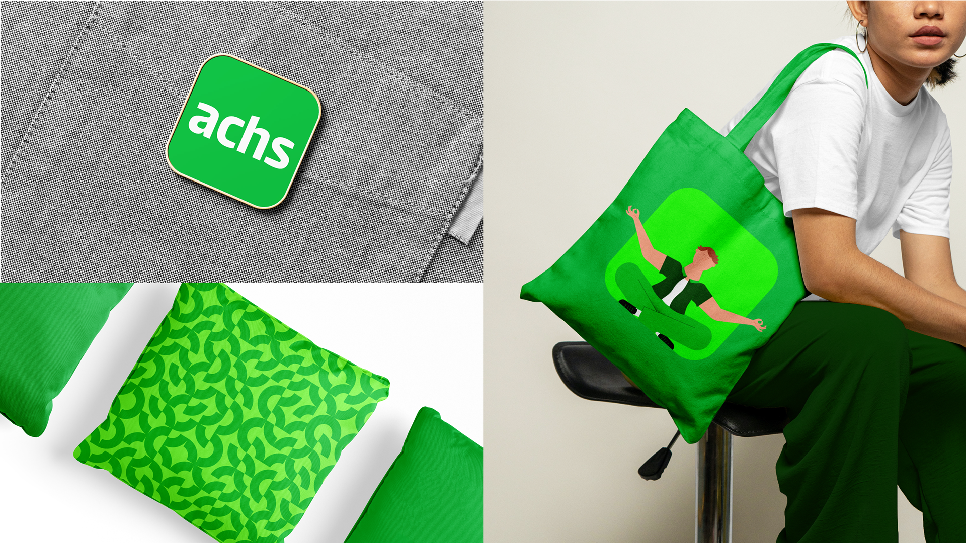
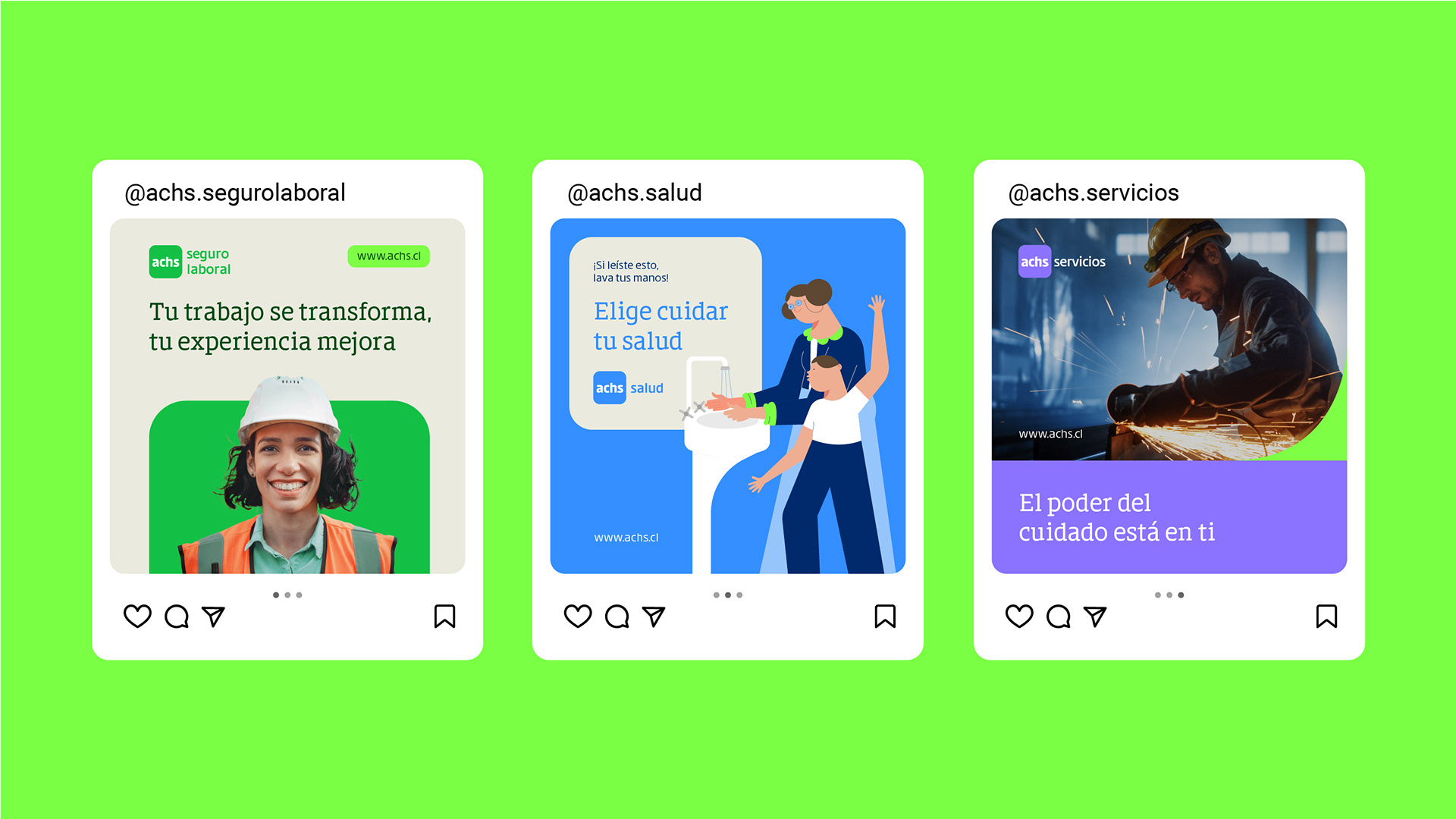
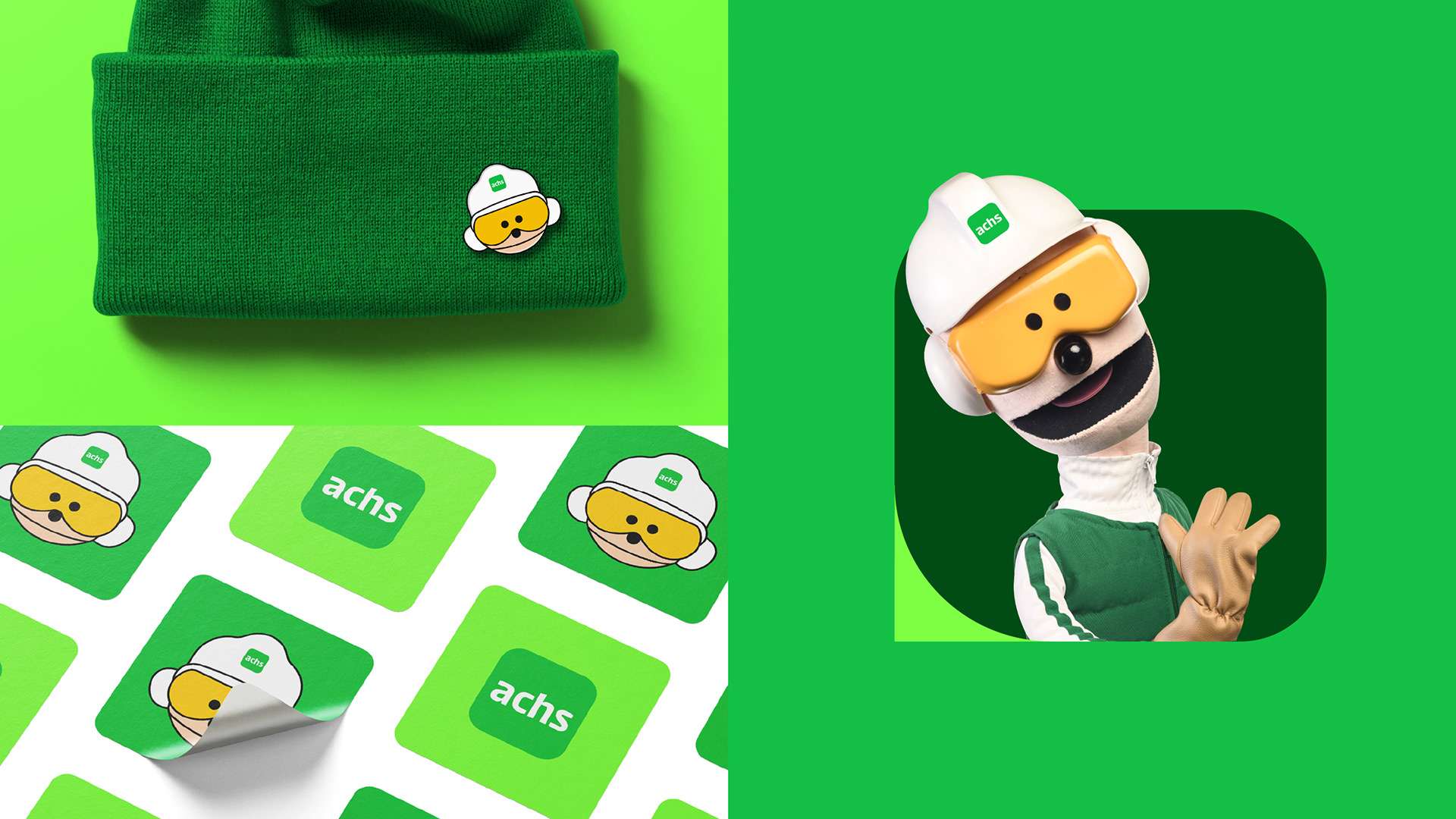
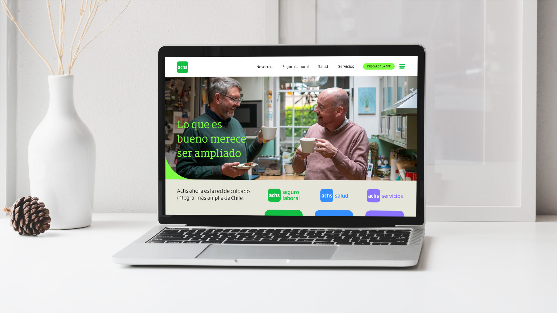
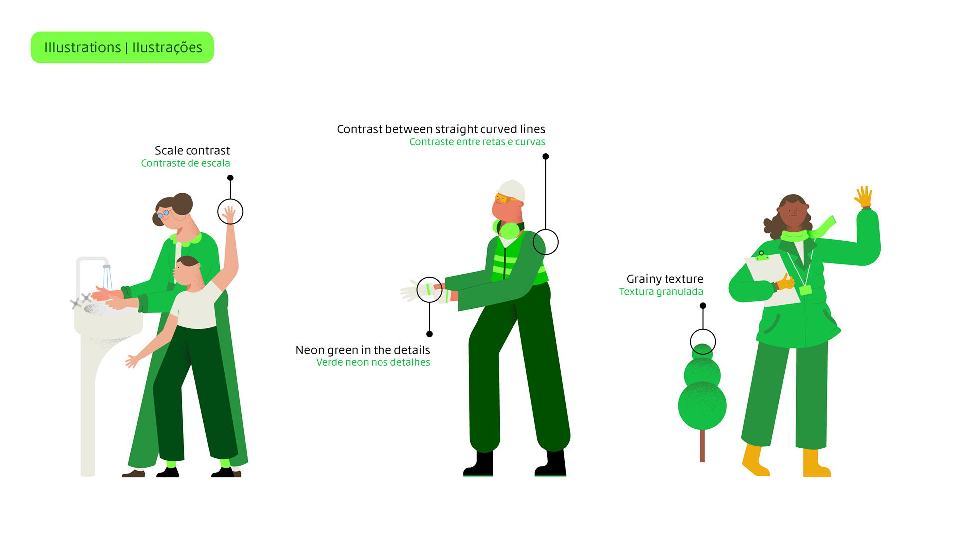
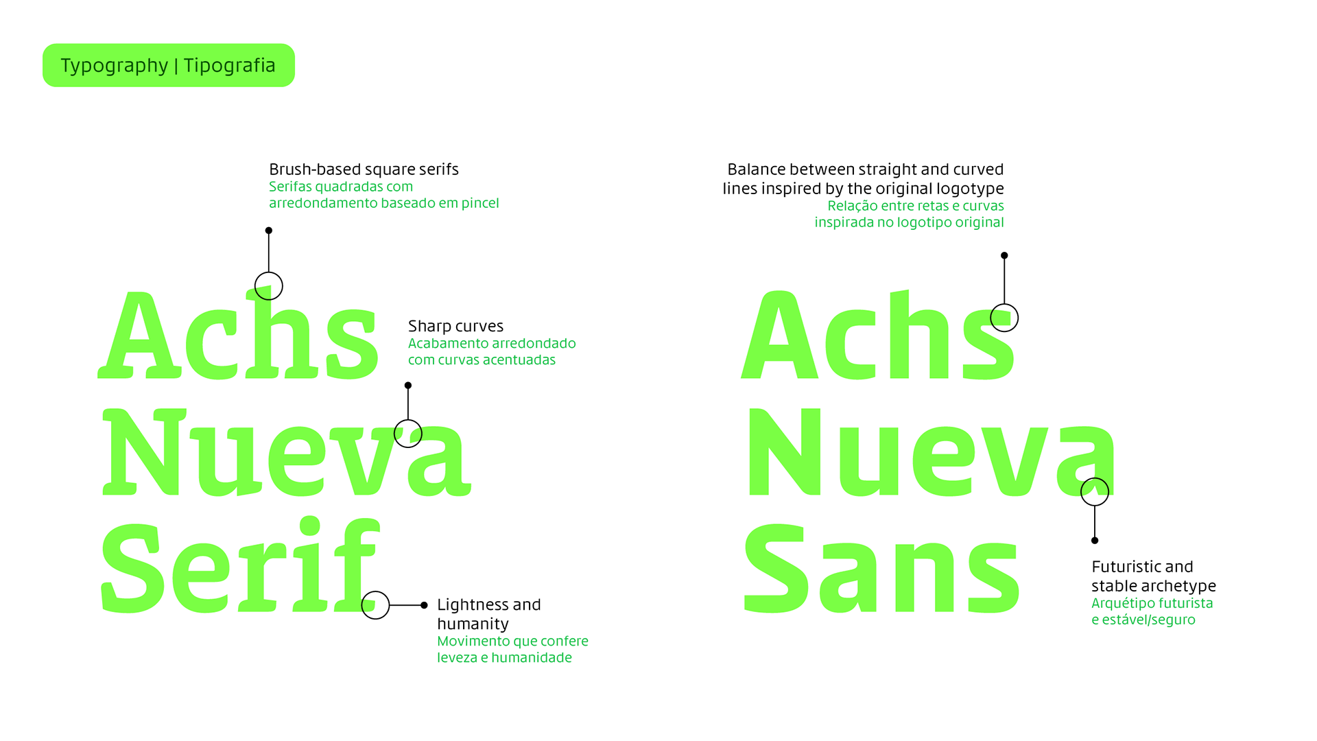
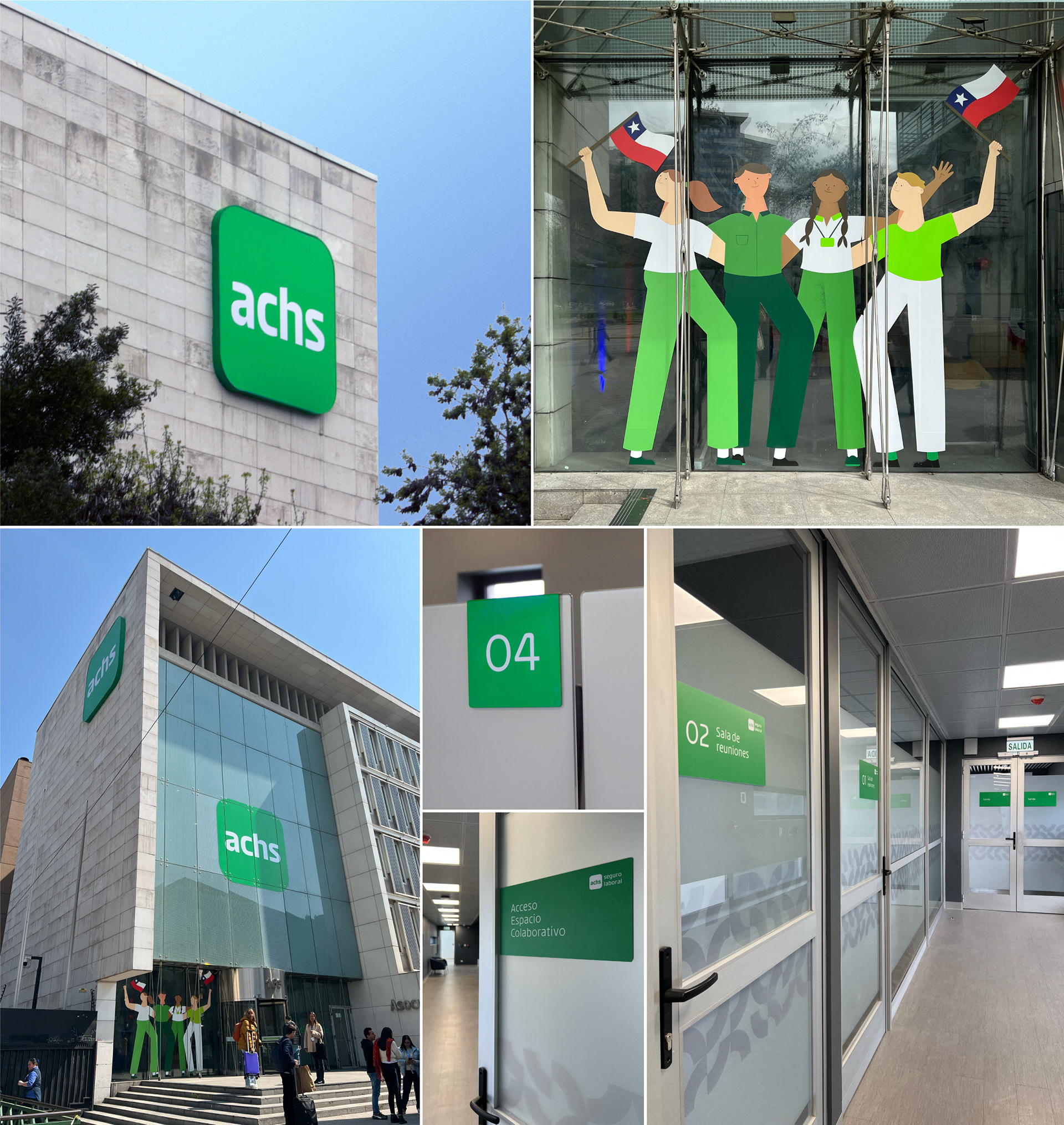
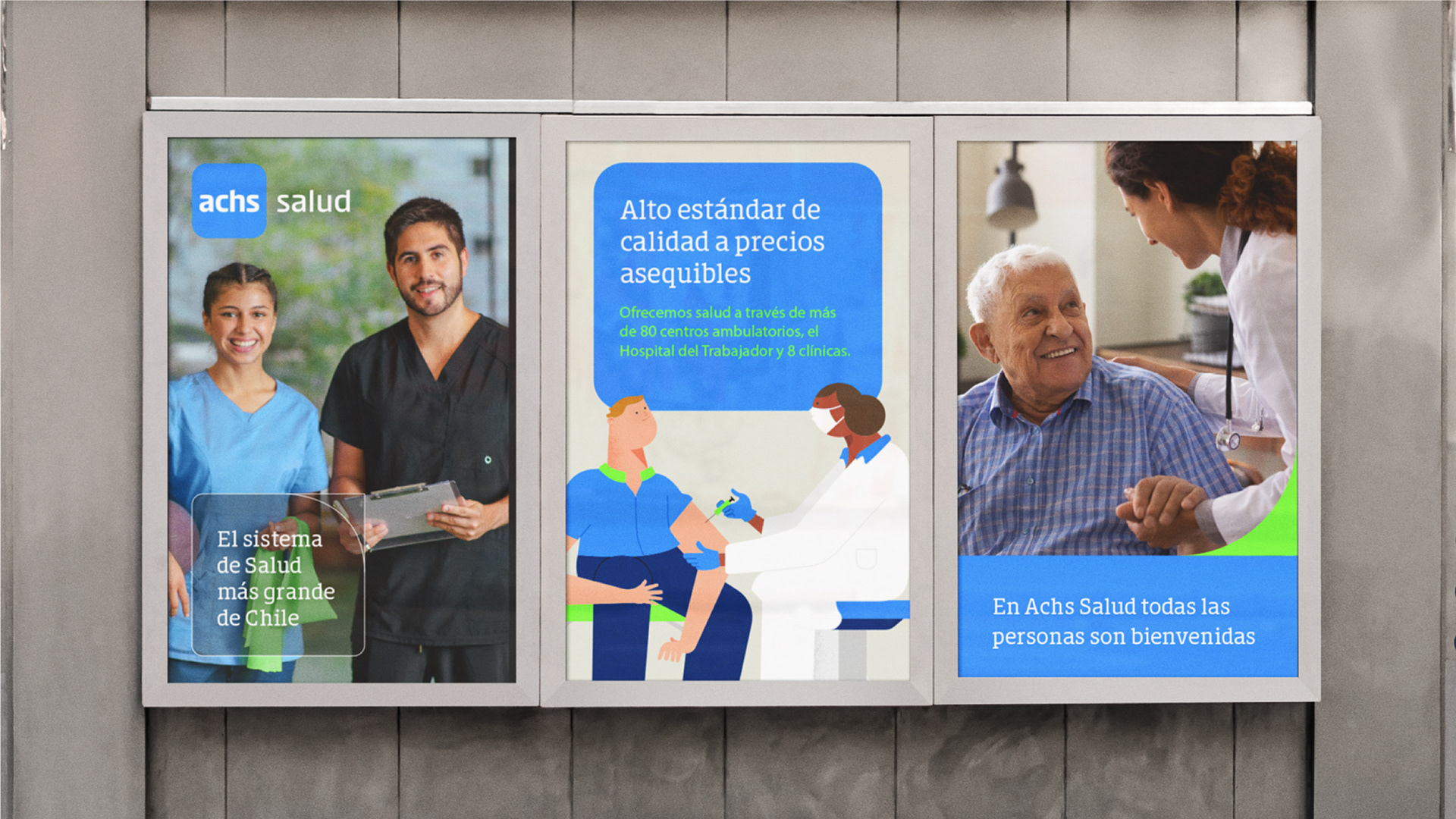
We kept and reinvented the two assets Chile already knew how to read: the square and the green. Around them, a new system — a parent brand with three sub-brands, two bespoke typefaces, proprietary illustration, and a photographic style that invites care rather than warning about risk.
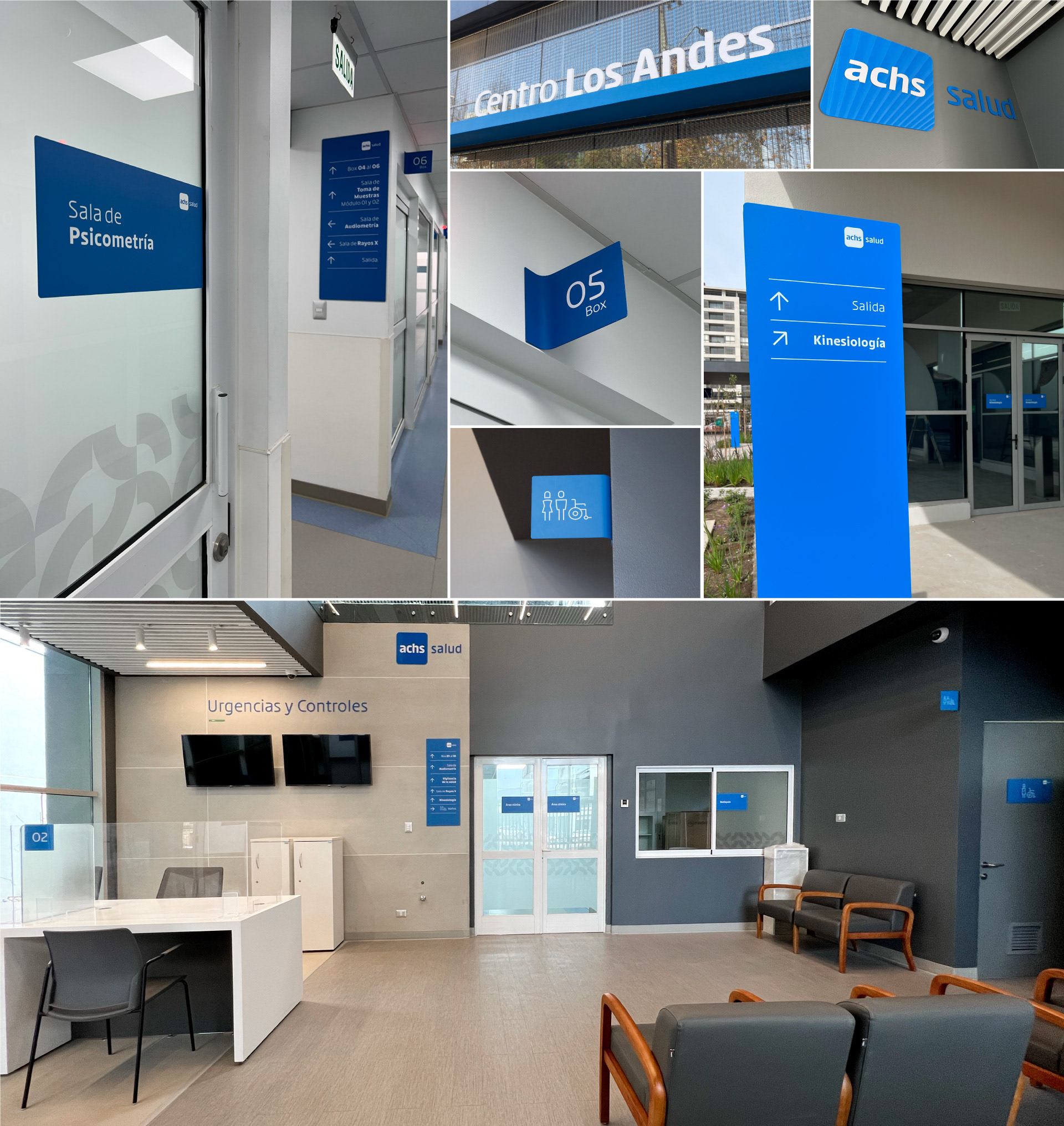
My first project at Interbrand. I supported the creative director through strategy and concept, then led refinement, the design system and implementation — including two typefaces drawn from scratch with one of Brazil's leading type foundrys, Plau, and rollout nationwide.

Project direction | Direção de projeto: Rodrigo Marques
Creative direction | Direção criativa: Gil Bottari
Creative coordination | Coordenação criativa: Laila Rotter
Brand strategy | Estratégia de marca: Rodrigo Maques, Alice Araújo, Tainara Crepaldi e Andrea Barrueto
Visual identity | Identidade Visual: Laila Rotter e Taís Andrade
Iconography | Iconografia: Gabriel Deda
Verbal identity | Identidade Verbal: Alice Araújo e Tainara Gomes
Type system | Tipografia: Ana Laura Ferraz, Carlos Mignot e Rodrigo Saiani (Plau Design)
Illustration | Ilustrações: Tomas Olivos
Interbrand São Paulo, 2023

Brasil Design Awards | Bronze | Achs Arquitetura de Marca


